Visualising statistics.gov.scot with Tableau (csv download)
This guide introduces the principles of visualising data from statistics.gov.scot using Tableau. Tableau is a popular tool used for visualising and exploring data, and the public version is free. You can download the public version of Tableau here: https://public.tableau.com/en-us/s/download
One of the great things about Tableau is the community that has formed around it. There are lots of good blogs, documentation, and forums to access help. This guide is intended to get you started using Tableau with statistics.gov.scot linked open data. We are going to make a simple visualisation, and you can then use these additional resources to improve it, or make your own visualisations in Tableau.
There are a few ways to start using data from statistics.gov.scot in Tableau. In this guide we’re going to look at downloading a csv file containing data about looked after children in council areas in Scotland and using that to make a simple interactive visualisation.
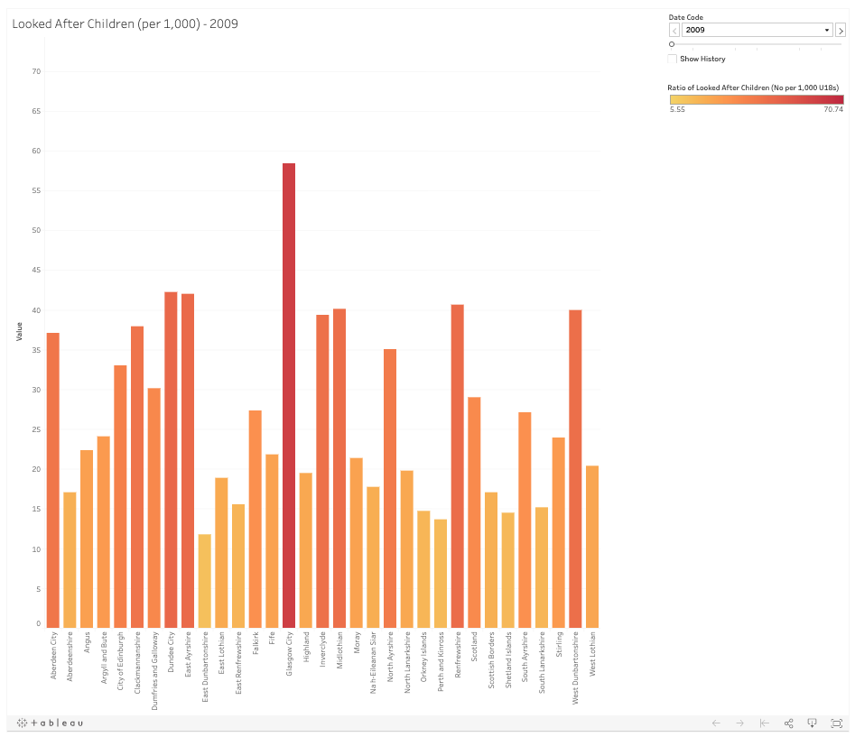
This is what we’re aiming for - a bar chart with variable colouring, tooltips on hover which reveal more information, and a control to change the year:
To get the data on Looked After Children, we first need to search for looked after children. See this guide for finding data by keyword on statistics.gov.scot for help on this. The dataset that we are interested in is called ‘Looked After Children’. For this exercise, we’re going to download the entire dataset, by clicking the ‘csv’ button on the main dataset page:

This will download a csv file to your computer, containing all the data in the dataset, a one-row-per-observation form. This makes it easy to work with in Tableau, as well as in other tools such as R or Python.
Then open up Tableau desktop, and you will be prompted to create a Tableau public account (or sign in if you already have one). Follow the instructions to do this.
You should now see this screen, and this is where we start a project.

To import our data, select ‘Text file’ in the left sidebar, navigate to the file that we have just downloaded, and click open.
You will then be presented with a window that looks similar to this, which allows us to preview the data.

The first thing we need to do is to check the data types of our ‘Value’ field. That is currently set to a whole number, and we need to change it to Decimal Number, to account for the ratio values in the dataset. Click the `#` at the top of the Value column, and select `Number (Decimal)`.
The next thing that you may notice is that the download only came supplied with a Feature Code. This is the official code for each area in the dataset. In order to make the visualisation useful we really need the area name. To do this, we’ll need to download a lookup file, which we can then use in our visualisation.
Getting a lookup file is fairly straightforward using the SPARQL console. You can read more about how to SPARQL here, but to get the lookup file for all geographical areas in statistics.gov.scot, you can go to https://statistics.gov.scot/sparql, paste the following query into the query builder, change the results format to csv, and click ‘Run Query’
PREFIX rdfs: <http://www.w3.org/2000/01/rdf-schema#>
PREFIX skos: <http://www.w3.org/2004/02/skos/core#>
SELECT ?AreaCode ?AreaName ?AreaType
WHERE {
    ?s a <http://publishmydata.com/def/ontology/foi/Feature> ;
    rdfs:label ?AreaName ;
    skos:notation ?AreaCode ;
    <http://statistics.data.gov.uk/def/statistical-entity#code> ?areatype_uri .
    ?areatype_uri rdfs:label ?AreaType
}
Save the outputted file to your Tableau folder (or elsewhere), and open the Tableau window up again.

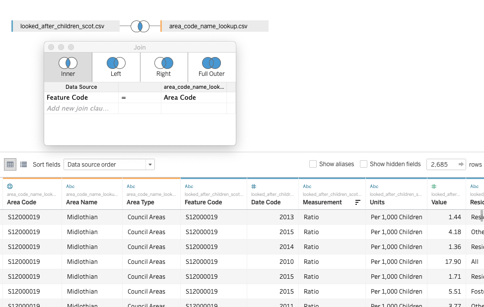
You can then select the ‘Add’ button in the Connections section of the left panel to add your new lookup csv file. Tableau will then ask you to define how the two datasources should join together.

Selecting the geographical identifiers in the two datasets, ad making sure it’s an inner join mean that our Looked After Children data now has the Council name alongside the values
Now that our data has been prepared, we can build our visualisation (in this case, a simple bar chart). Clicking ‘Sheet 1’ in the bottom left corner of the window will open a new canvas for making our visualisation.
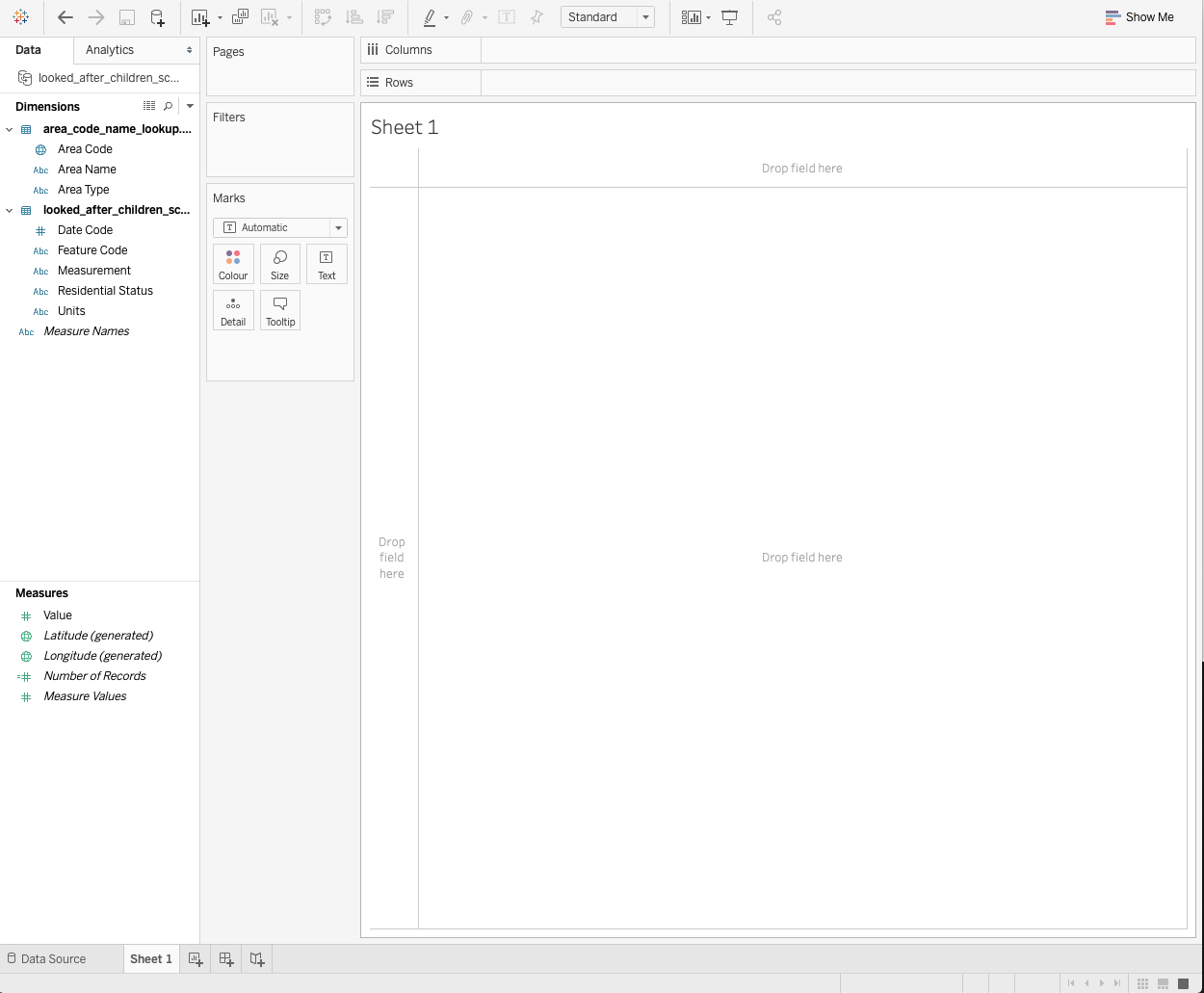
Tableau is generally smart enough to work out which fields are dimensions (ie axes on a chart) and which are measures (the observation values - in this case the number and ratio of looked after children).
We can simply drag and drop the dimensions and measures into the different sections of the canvas. For what we want here, we’re first going to drag the `Area Name` dimension to the `Columns` section at the top of the canvas.

Then we’ll drag the `Value` measure to the `Rows` section.

At this stage, the visualisation represents the sum of all values for both measurement types (count and ratio) across all years, so we now need to filter these values.
Firstly we’ll set it so that we only see the ratio on the charts, and disregard the counts. To do this, drag the `Measurement` dimension to the `Filter` panel, click the item, and select only `ratio`.

Then we can add the `Date Code` to the `Pages` panel to allow our users to flick through the years, and even play them as an animation.
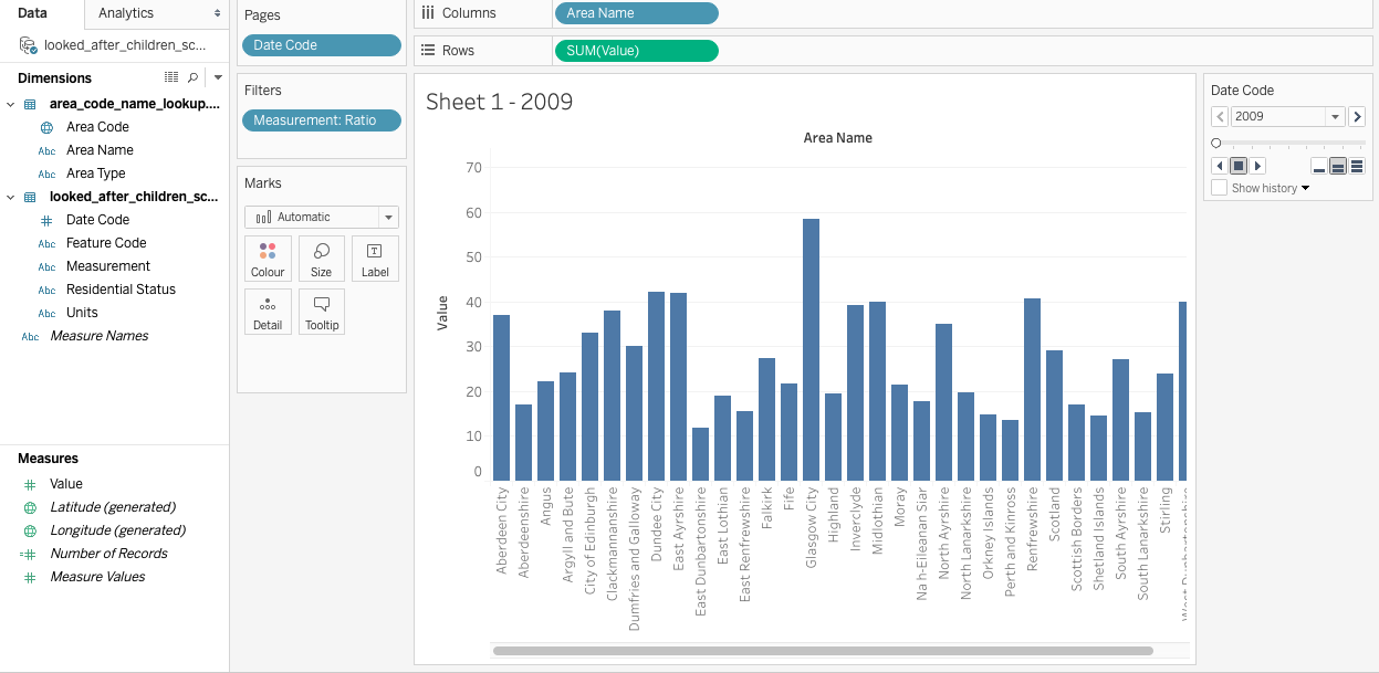
Finally, if we drag another ‘Value’ measure to the ‘Marks’ panel, we can change the colour of the bars so that they get darker if the ratio value is larger.

A few final tweaks to titles and colours leaves us with this simple, but attractive bar chart.

We can now save this visualisation to Tableau’s public servers by clicking the Save icon in the top menu bar, where anyone can view it. This version is available here:
https://public.tableau.com/profile/jamie.whyte#!/vizhome/ScotlandLookedAfterChildren/Sheet1
You can hover over the bars to view the data, change the year, and view the underlying data.
